- Connotation is the meaning of a sign that is arrived at through the cultural experience a reader brings to it. In other words it is an idea that is implied or suggested when an object or an image is percieved. For example I may look at a dove and it may give me connotations of peace, harmony, love, justice and so on.
- Denotation is what an image actually shows and what is immediately appaent, as opposed to the assumptions that an individual may make about it. In other words it is when a large number of people can agree on the properties of an object. For example we can all agree that what we see is a bicycle and it is red.
We then looked at how different fonts used in title sequences of films can connotate/imply different meaning and messages. From this lesson i have realised that fonts really do count as a sort of 'mis-en-scene' aspect of the film. It really is the small things that really count....
As an example we first looked at the font that is used in Avatar. We found out that the name of the font used as the title and also as the font for the text used in the subtitles is called 'Papyrus'. It is quite a stylish fonts and my class came up with many connotations for it...
| As you can see the Papyrus font has been used on this Avatar poster... |
 | ||
| As you can see in this Simpsons film, the Papyrus fonts is used for the banner of the shop called 'The picky vegan'. The Picky Vegan can mean 'vegetarians who are picky with food' so it is as if they are trying to use the font to almost mock vegetarians as the font has connotations of natural things such as plants and trees (fruits and salads and so on which vegetarians eat)
|
We then looked at the two main categories that fonts can go into. They are called Serif and San serif fonts.
- Serif fonts; Serif fonts are generally more traditional and often slightly more formal than sans serif fonts. These are fonts such as Times and Courier, below is a diagram to illustrate what I mean...
 |
| As you can see the fonts have finishing strokes or flourishes on the ends and edges of each letter (where I have circled it in red). These types of fonts are usually used for formal writting such as in letters. |
 |
| As you can see these fonts don't look formal and are often used when writting a letter to a friend, on leaflets, magazines and so on.. |
ANALYSING THE FONT USED IN THE FILM 'PROM NIGHT'....
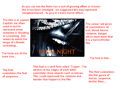
We then got into groups and each group was given a poster of a film in which we had to analyse the fonts used on the poster. We were given the poster of the film called 'Prom Night', and we wrote our annotations for the poster. I took an image of it below...
 |
| The image is not very clear but as you can see we have written out annotaitons around the poster |
| This is a close up image of our poster... |
 |
| I have added our annotations onto the image (sorry that the writting is so small!) |


No comments:
Post a Comment